

Author

A step by step guide on how to detect, outline and classify farm plots on satellite images
This article is part of a 2-article series about satellite images processing applied to agriculture. If you’re interested in the collection and processing of the satellite images, please refer to this first article by Antoine Aubay.
Part 2 focuses on how we leveraged these processed satellite images in an agricultural context in order to:
Illustration of the target process
Part 2 focuses on how we leveraged these processed satellite images in an agricultural context in order to:
TL;DR:
This article will:
This article assumes basic fundamentals in data science and computer vision.
Business motivation
A solution able to automatically detect and label crops can have a wide range of business applications. Computing the number of plots, their average size, the density of vegetation, the total surface area of specific crops, and plenty more indicators could serve various purposes. For example, public organizations could use these metrics for national statistics, while private farming companies could use them to estimate their potential market with a great level of detail.
Naturally, Satellite imagery was considered and identified as a very viable data source for 3 specific reasons:
Step 1 — Detecting agricultural areas on satellite images
![]()
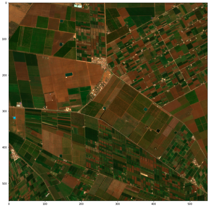
Sentinel-2 raw image: 10 000 x 10 000 pixels, each pixel 10 x 10 meters on the ground (Copernicus Sentinel data 2019)
After retrieving and preprocessing Sentinel 2 images, our first challenge was to locate the plots and limit ourselves to specific areas of interest. Each image having a very high resolution, it would not be realistic to apply the whole processing to full size images. Instead, the first step to solve our problem was to crop large images into smaller fragments, and identify the areas where the plots were located on these smaller images:
Our desired output: fragments containing only agricultural areas (Copernicus Sentinel data 2019)
Solution 1A: Training a pixel classifier
The first solution for detecting agricultural zones on large images is to build a pixel classifier. For each pixel, this machine learning model would predict whether this pixel belongs to a forest, a city, water, a farm … and therefore, to an agricultural zone or not.
![]() Illustration of pixel classification with 3 visible classes of pixels (Copernicus Sentinel data 2019)
Illustration of pixel classification with 3 visible classes of pixels (Copernicus Sentinel data 2019)
Because a lot of resources can be found for Sentinel-2, we were able to find labeled images with over 10 different classes of ground truth (forest, water, tundra, …). However, if the climate of your area of study is different from the area you trained your model on, you might have to reevaluate the classes attributed to each pixel.
For example, after training a model on temperate climate countries, and applying them to more arid regions of the world, we observed that what the model was seeing as forests and tundras were in fact agricultural crops.
Once your pixels are classified, you can drop all images that don’t contain any agricultural areas.
Solution 1A pros:
Solution 1A cons:
Out of all available methods to detect agricultural zones, this one was the most accurate. However, if you do not have access to labeled images, we have identified two alternative solutions.
Solution 1B: Mapping geo coordinates to pixel coordinates
If coordinates about your zone of interest have been labeled, or if you’re labeling coordinates by yourself, it is possible to map these geo coordinates (latitude and longitude) to your images.
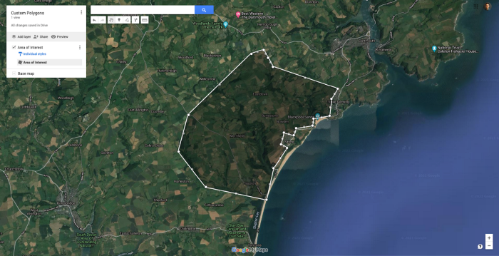
You can design your own polygons on GoogleMaps, thus focusing on a specific area of choice while drawing around obstacles (water, cities …)
For example, if you have the coordinates associated with large farming areas, or if you draw large polygons on Google Maps yourself, you can easily obtain geo coordinates of agricultural areas. Then, all there is to do is map those coordinates to your satellite images and filter your images to only cover the zones within your polygons.
Solution 1B pros:
Solution 1B cons:
Solution 1C: Using a vegetation index
It is possible to compute a vegetation index from the color bands provided by the satellite images. A vegetation index is a formula combining multiple color bands, often highly correlated with the presence or density of vegetation (or other indicators such as the presence of water).
Multiple indices exist, but one of the most commonly used ones in an agricultural context is the NDVI (Normalized Difference Vegetation Index). This index is used to estimate the density of vegetation on the ground, which could serve to detect agricultural areas over a large image.
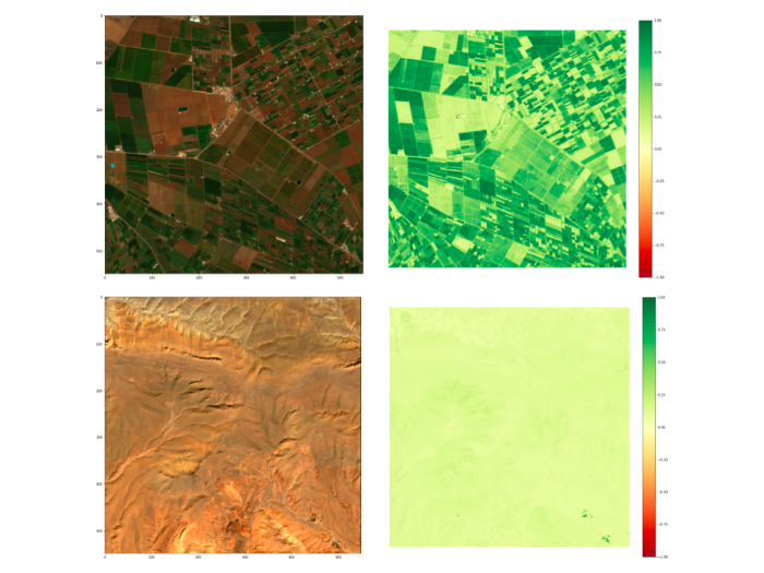
Visual representation of the NDVI on an agricultural zone and a desert (Copernicus Sentinel data 2019)
After computing NDVI values for each pixel, you can set a threshold to quickly eliminate pixels with no vegetation. We used NDVI as an example, but experimenting with various indices could help achieve better results.
Note that computing a vegetation index can provide you with useful information to enrich your analysis, even if you have already implemented another way to detect agricultural areas.
Solution 1C pros:
Solution 1C cons:
Step 2 — Detecting and outlining agricultural plots
Building an unsupervised edge detector
Once you have determined the location of your agricultural zones, you can start focusing on outlining individual plots on these specific areas.
In the absence of labeled data, we decided to go for an unsupervised approach based on OpenCV’s Canny Edge detection. Edge detection consists in looking at a specific pixel and comparing it to the ones around it. If the contrast with neighboring pixels is high, then the pixel can be considered as an edge.
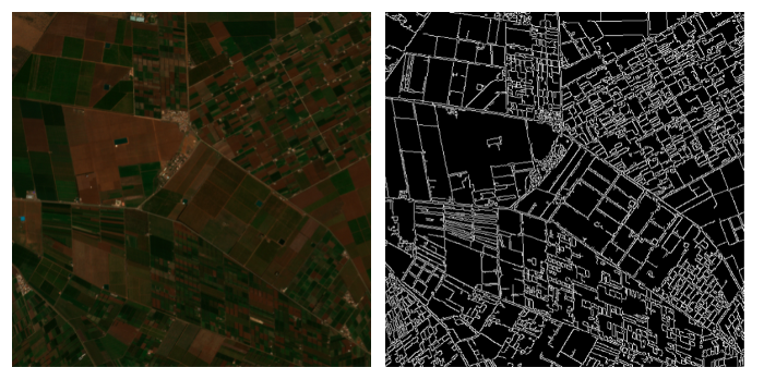 An example of edge detection on agricultural plots using OpenCV (Copernicus Sentinel data 2019)
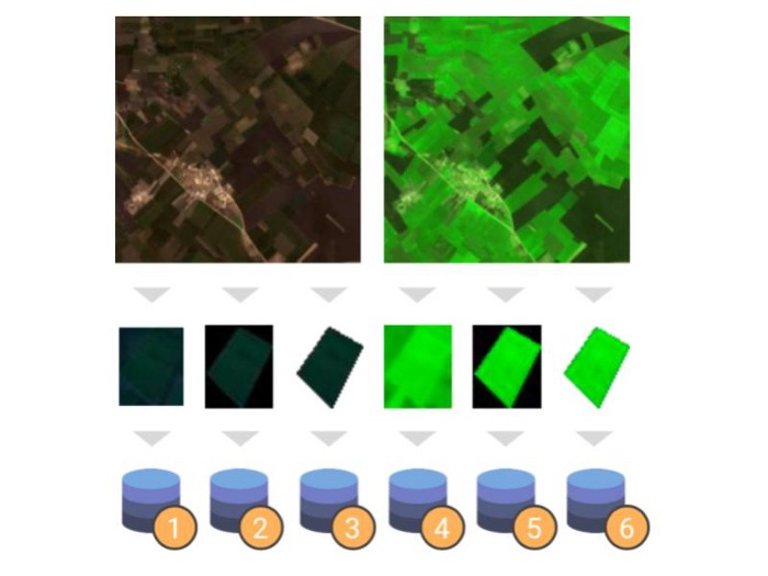
Once all the pixels that could potentially be true edges have been identified, we can start smoothing out the edges and try to form polygons. As expected, the performance of the edge detection algorithm is proven to be much better when applied to large plots:
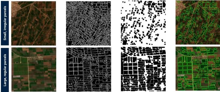
Illustration of the full process of outlining plots (Copernicus Sentinel data 2019)
This method allowed us to automatically identify close to 7 000 plots in our area of interest. Because we used the pixel classification method (see step 1A), we were able to to separate real farm plots from other polygons, thus only retaining relevant data.
![]() Polygons consisting of a minority of “farm pixels” were eliminated (Copernicus Sentinel data 2019)
Polygons consisting of a minority of “farm pixels” were eliminated (Copernicus Sentinel data 2019)
Optimizing of the performance of the edge detection algorithm
In order to have the best possible results, it could prove useful to apply modifications to your image, notably by playing around with contrast, saturation or sharpness:
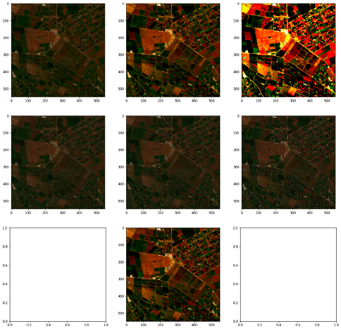
Experimenting on contrast, saturation or sharpness can help improve the efficiency of the edge detection (Copernicus Sentinel data 2019)
Another critical success factor is forcing the polygons to be convex. Most plots following regular shapes, forcing convex polygons can usually yield much better results.
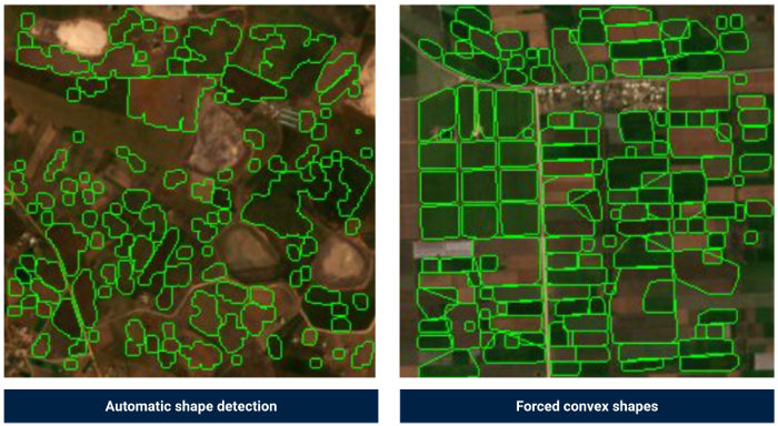
Forcing convex shapes fits most plots much better (Copernicus Sentinel data 2019)
Step 3 — Classifying each parcel to detect specific crops
Once all plots have been identified, you can now crop each of them and save them as individual image files. The next step is to train a classification model in order to distinguish each parcel based on its crop. In other words, trying to identify tomato crops from cereals, or potatoes.
Building a labelled training set
Because we did not have an already labelled dataset available, and because manually labelling hundreds of images would be too time consuming, we looked for complementary datasets containing the information about crops for specific plots at a given time and place.
The ideal scenario would be to have pre-labelled images, but in our case we only had the geo coordinates and crops of a few hundred farm plots in our area of interest. This dataset contained a list of plots, the latitude and longitude of its center, and the crop planted on it at a specific time of the year.
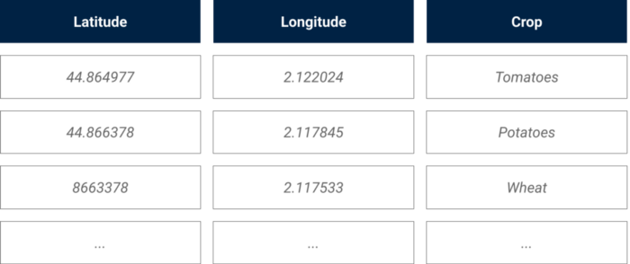
Illustration of the external crop data source
In order to build our training set, we used our geo coordinates to pixel coordinates converter (shared in Part 1) to identify the specific plots for which we had a label (the crop) in our image bank.
Out of the 7 000 plots identified in Step 2, we managed to label around 500 plots thanks to our external data source. These 500 labelled plots served to train and evaluate the classification model.
Modelization
We chose to use a convolutional neural network using the fastai library, as it was an efficient way to classify our images.
In order to find the best possible classifier, we experimented with the input data:
Dozens of models were trained on datasets generated with various of data preparation techniques
After experimenting with various classification models, we reached 78% accuracy and 74% recall when performing binary classification on the smallest plots (and thus the hardest to classify due to the low number of pixels).
Challenges to keep in mind
When working with farm plots, even a few weeks can make a substantial difference. Within a few weeks, wheat crops can go from green to gold to harvested:
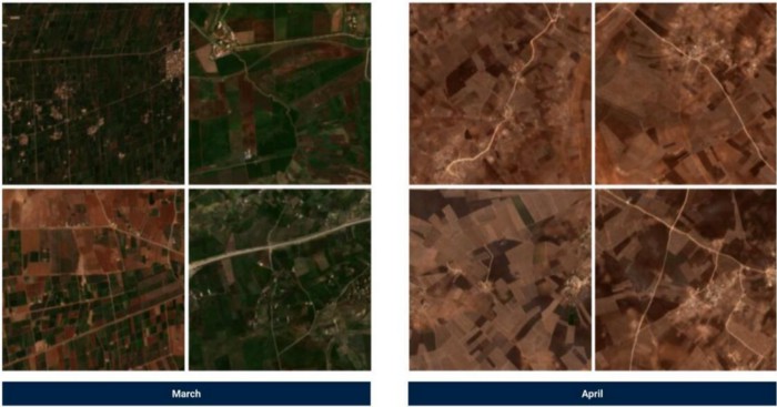 When working with farm plots, just a few weeks can make a large difference (Copernicus Sentinel data 2019)
Thus, there are two things to keep in mind in order to replicate this project throughout the year:
Conclusion
Working with satellite images opens up an endless range of possibilities. Considering how each Satellite provides different features, and how the availability and format of complementary data can vary throughout the world depending on your area of study, every single project will end up as a unique use case.
We hope that sharing our perspective and methodologies will inspire you in your own projects ! If you’re feeling eager to start working on your own satellite imagery project, make sure to read “Leveraging satellite imagery for machine learning computer vision applications” by Antoine Aubay.
Thank you for reading, don’t hesitate to follow the Artefact tech blog if you wish to be notified when our next article releases !