How to choose the right visualizations and implement them in Streamlit to better debug your forecasting models
TL; DR
When dealing with forecasts models, the best approach is often to iterate continuously, adding some data sources, improving feature engineering, tweeking model parameters… Most of the time Data Scientists tends to be fixed to only one KPI (i.e. RMSE, Forecast Accuracy…). There is often lot more information behind those KPIs that needs to be analyzed to improve prediction. Building an appropriate visualization tool is a great mean to deep-dive into the model behavior, spot quickly pain-points of your model, and thus gain in accuracy efficiently.
This article will develop the key questions one should ask him/herself when evaluating a forecasting model, then present must-have visualizations to answer these questions and finally propose a quick implementation under a unified tool to gather all these visualization using Streamlit.
Context
This article sums up what we learned from building a unified visualization tool to help Data Scientists, Software Engineers, Product Owners & Demand Planner (business experts) develop sell-in forecasting models for 10+ business units in a food & beverage company. Our models made forecasts at a Daily x Warehouse x Product level, for the coming 14 weeks. These were developed using boosting methods, and take into account product characteristics, historical sales, events and promotional data.
Key questions to ask when evaluating a Forecasting model
1. Is the model good compared to the baseline?
Having access to current predictions (for instance demand planner forecasts) on the same scope is very helpful. It allows a good understanding of the business behaviour on a specific period, product or location. The more you interview the Business, the more you gain insights, and the more you can implement the right features.
2. Chasing over or under-predictions and drops in Forecast Accuracy
Must have questions are: Do I catch the global trend? Does the model catch known recurrent events like holidays, warehouses closure, school holidays? Do I have some accuracy drops on particular periods?
Why is it important?
Spotting such events is a great way to reach efficiently more accurate predictions. These are often well known by demand planners and quite simple to implement in your model when you have the information. For example, in many of our business units, some products were sold for school lunches. Introducing and preparing a feature representing school holidays led to a great increase in our accuracy on these particular periods.
3. Dealing with product specificities
Is my performance homogeneous on my products brands / families? Are there any other distinction between my products (products sold only during promotions periods, best-sellers vs. low volumes products, products )?
Why is it important ?
These questions help you understand the business more precisely. For example, splitting models based on the importance of the products in terms of volume often lead to the increase of the performance. Indeed, the demand for regular products is very different from the demand for promotional products or less common ones, which can be highly correlated with promotion periods or have a very sparse sales profile. In most of our cases, we trained distinct models to address those different types of products.
4. Do the constitutive effects are correctly taken into account?
Is the model correctly capturing promotions effects? Are there cannibalization effects? Does the model adapt well to exogenous phenomena (ex: strikes)?
Why is it important?
Please feel free to refer to the previous article of our Forecasting Series to tackle promotion data: 5 tips to better take promotional data into account
How to analyze your forecasting model : from macro-KPIs to the evaluation on a specific scope
What are the must-have visualizations?
To build your evaluation tool, you must combine two elements :
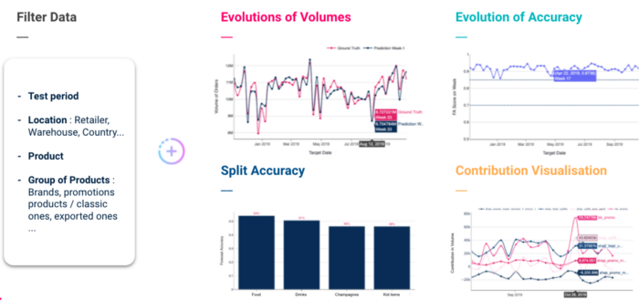
The filter part must allow to filter on several axes : period of analysis, locations (retailer, warehouse …), products (a set of products), and finally product categories.
We recommend at least the 4 following visualizations:
How to start building your forecasting studio dashboard using Streamlit?
Streamlit is an open source python library to create shareable web apps in minutes and is still gaining popularity across Data Science community. In this article, we will not present the tool as many articles are already available on this topic, but we will focus on the easy implementation of one visualization.
The choice of using Streamlit for this type of project was motivated by several pre-requisites :
1. Global structure of your forecasting dashboard
Before diving into the implementation, the prerequisite in building a dashboard is to draw the parts of your application.
To be clean in your implementation, you can divide your code into several parts:
| ├── config.py | ||
| ├── forecasting_studio | ||
| │ ├── forecast_analysis | ||
| │ │ └── fig_forecast_analysis.py | ||
| │ └── pages | ||
| │ └── forecast_analysis.py | ||
|
The main page will set-up the global structure of your app, i.e. the global layout of your app : in our case, a wide layout, and a sidebar to display the name of your app and the available pages.
| import streamlit as st | |
| from forecasting_studio.pages import forecast_analysis | |
| PAGES = | |
| def write_page(page): | |
| page.write() | |
| def main(): | |
| st.sidebar.title("Forecasting Studio") | |
| selection = st.sidebar.selectbox("", list(PAGES.keys())) | |
| page = PAGES[selection] | |
| write_page(page) | |
| if __name__ == "__main__": | |
| st.set_page_config(layout="wide") | |
| main() |
The configuration file, that we gather the colors and different configs for all your Plotly figures.
| X_AXIS_TEMPLATE = dict(showline=True, | |
| showgrid=False, | |
| showticklabels=True, | |
| linecolor=“grey”, | |
| linewidth=2, | |
| ticks=“outside”, | |
| tickfont=dict(family=“Arial”, size=12, color=“rgb(82, 82, 82)”)) | |
| Y_AXIS_TEMPLATE = dict(showline=True, | |
| showgrid=True, | |
| linecolor=“grey”, | |
| gridcolor=“lightgrey”) | |
| LEGEND = dict(orientation=“h”, yanchor=“bottom”, y=1.02, xanchor=“right”, x=1) | |
| COLORDISCRETE = [“#002244”, “#ff0066”, “#66cccc”, “#ff9933”, “#337788”, | |
| “#429e79”, “#474747”, “#f7d126”, “#ee5eab”, “#b8b8b8”] |
2.Building “Evolution of Forecast Accuracy visualization”
First we will gather our Plotly figures in one script:
| import pandas as pd | |
| from typing import List | |
| import plotly.graph_objects as go | |
| from config import COLORDISCRETE, LEGEND, X_AXIS_TEMPLATE, Y_AXIS_TEMPLATE | |
| def fig_evolution_of_fa(forecasts_per_target_date: pd.DataFrame, | |
| events: List = None) -> go.Figure: | |
| “””Figure representing the evolution of the Forecast Accuracy | |
| on the backtest period | |
| Parameters | |
| ———- | |
| forecasts_per_target_date : pd.DataFrame | |
| Forecast dataset containing at least 3 columns : | |
| – ‘target_date’ : the date for which you forecast | |
| – ‘forecast_accuracy’ : your accuracy KPI | |
| – ‘week_nb’ : week ID (from 0 to 52) | |
| – (optional) ‘demand_planner_forecast_accuracy’ : your baseline forecast | |
| Primary Key : ‘target_date’ | |
| events : List, optional | |
| a list of couple of dates, representing periods, by default None | |
| “”” | |
| fig_fa_score = go.Figure() | |
| fig_fa_score.add_trace( | |
| go.Scatter( | |
| name=“Model Forecast Accuracy”, | |
| x=forecasts_per_target_date[‘target_date’], | |
| y=forecasts_per_target_date[‘forecast_accuracy’], | |
| hovertext=forecasts_per_target_date[‘week_nb’], | |
| marker_color=COLORDISCRETE[0])) | |
| # If you have a baseline, you can add an additional column to your | |
| # dataset to display it on a line plot | |
| if ‘demand_planner_forecast_accuracy’ in forecasts_per_target_date.columns: | |
| fig_fa_score.add_trace( | |
| go.Scatter( | |
| name=“Demand Planners Forecast Accuracy”, | |
| x=forecasts_per_target_date[‘target_date’], | |
| y=forecasts_per_target_date[‘demand_planner_forecast_accuracy’], | |
| hovertext=forecasts_per_target_date[‘week_nb’], | |
| marker_color=COLORDISCRETE[2])) | |
| fig_fa_score.update_xaxes(range=(min(forecasts_per_target_date[‘target_date’]), | |
| max(forecasts_per_target_date[‘target_date’]))) | |
| fig_fa_score.update_traces(mode=‘lines+markers’, line_shape=‘spline’) | |
| fig_fa_score.update_layout( | |
| xaxis_title=“Target Date”, | |
| yaxis_title=“FA Score”, | |
| plot_bgcolor=‘white’, | |
| legend=LEGEND, | |
| xaxis=X_AXIS_TEMPLATE, | |
| yaxis=Y_AXIS_TEMPLATE) | |
| if events: | |
| fig_fa_score.update_layout( | |
| shapes=[get_vertical_filled_area(segment[0], segment[1], ‘rgb(102, 204, 204)’) | |
| for segment in events]) | |
| return fig_fa_score | |
| def get_vertical_filled_area(start: float, end: float, color: str = “blue”) -> dict: | |
| “””Return a plotly vertical shape dict, used to highlight events on figures””” | |
| return dict(type=“rect”, | |
| xref=“x”, | |
| yref=“paper”, | |
| x0=start, | |
| y0=0, | |
| x1=end, | |
| y1=1, | |
| fillcolor=color, | |
| layer=“below”, | |
| line_width=0, | |
| opacity=0.5) |
We will finally implement our forecast analysis page, that will loads our dataset, distributes our figures on different columns, …
| import pandas as pd | |
| import streamlit as st | |
| from forecasting_studio.forecast_analysis.fig_forecast_analysis import fig_evolution_of_fa | |
| def write() -> None: | |
| st.title(‘Forecast Analysis’) | |
| df = pd.read_csv(‘your_dataset.csv’) | |
| # You can load here some custom events to display | |
| # ex : events = [(‘2019-07-01’, ‘2019-09-01’), (‘2020-07-01’, ‘2020-09-01’)] | |
| events = None | |
| evo_cont1, evo_cont2 = st.beta_columns(2) | |
| evo_cont1.subheader(‘Evolution of Forecast Accuracy’) | |
| fig_evo_fa = fig_evolution_of_fa(df, events) | |
| evo_cont1.plolty_fig(fig_evo_fa) | |
| if __name__ == “__main__”: | |
| write() |
Tadam ! Here is our app :
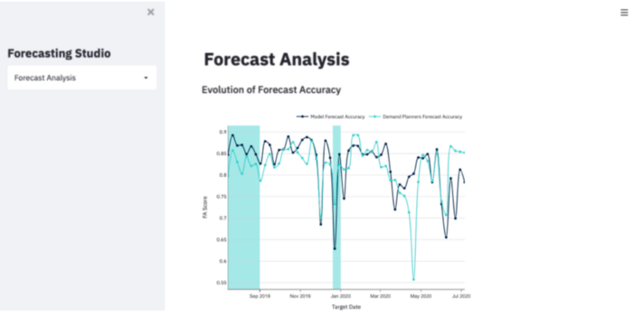
Let’s take a look at the presented figure. Regarding the previous points we discussed, here are the key points of our figure :
Conclusion:
Once you have build your visualization tool, it is time to deploy it. Here is a great ressource to share your app : How to deploy and secure your Streamlit App in GCP?
Thanks a lot for reading up to now, do not hesitate to reach out if you have any questions. You can find more about our projects by visiting our blog.

 BLOG
BLOG


