


作者

您需要为最新的时间序列预测项目设定基准?您想向企业 audience 解释预测模型的决策过程?您想在购买新车之前了解汽车价格是否具有季节性?我们或许能为您提供帮助!本文将介绍 Streamlit Prophet,这是一款网络应用程序,可帮助 data 科学家以可视化的方式训练、评估和优化预测模型。预测是利用先知(Prophet)这一快速且易于解释的模型进行的。.
您可以在线测试该应用程序 这里 但由于共享计算资源有限,可能无法随时使用。另一种方法是安装 python 软件包 并在本地运行。.
什么是流光先知?
Streamlit Prophet 是一个 Python 软件包,您可以通过它部署一个应用程序来构建时间序列预测模型。 视觉上 和 无需编码. .一旦上传了包含待预测信号历史值的 dataset,只需点击几下,该应用程序就能训练出一个预测模型,并提供多种可视化效果,帮助您评估其性能并获得更多见解。.
底层模型采用 先知, 是 Facebook 开发的用于预测时间序列 data 的开源库。信号被分解成几个部分,如趋势、季节性和节假日效应。估算器会学习如何分别对这些部分进行建模,然后将它们的不同贡献相加,得出易于解释的预测结果。当序列具有较强的季节性模式,并且有几个周期的 data 历史数据时,它的表现会更好。您可以查看 线程 或者这个 条 如果您想了解更多有关先知数学基础的信息,请点击此处。.
接口采用 流光溢彩, 这是一个用于构建 data 科学网络应用程序的 Python 框架。.
主要特点是什么?
Streamlit Prophet 旨在帮助 data 科学家和业务分析师快速启动和运行时间序列项目。举例说明,假设我们想根据 2011 年至 2015 年的历史 data 数据预测某家商店消费品的未来销售额。我们的 data 集如下表所示。.

带默认参数的基线模型一经上传,就会被安装到 data 上。现在让我们看看如何使用 Streamlit Prophet 对其进行改进,从而更好地理解这一现象。.
Data 勘探
任何预测项目的第一步都是确保 dataset 对您没有秘密。先知原生提供了一个很好的 信号分解 来帮助您实现这一目标。应用程序中提供了多个图表,让您对这些有价值的见解一目了然。.
下图是一个很好的起点,因为它提供了上载时间序列的全局表示,并包含大量有用信息。.

黑点是实际的历史销售量,大多数情况下每天在 75 到 225 件之间。在每年年底的圣诞节前后,商店可能会关门,这时可以发现一些没有销售额或销售量较低的异常值。趋势显示在一条红线上,以便对信号进行更综合的观察,并直观地了解全球演变情况。最后,蓝线代表的是根据 dataset 自动训练的先知模型做出的预测。在这里我们可以看到,该模型预计 2016 年的销售额将增长,延续 2015 年开始的增长趋势。.
这些预测似乎是季节性的,但在第一幅图上很难分辨出不同的周期成分。让我们再看看另一个可视化图,以了解这些季节性模式对模型输出的影响。.

我们发现了两个周期性现象,它们为了解消费者的习惯提供了一些有趣的启示。周周期显示,大多数人在周末购物,在此期间,预测每天增加近 40 件。图表还显示,销售的产品每年都有季节性,夏季的销售量略高于其他季节。然后,估算器将把这些周期性因素和总体趋势结合起来,得出未来几天的预测结果。.
绩效评估
这些图综合了先知对 data 的建模方式,但我们如何才能确保这种表示方法是可靠的呢?为了回答这个合理的问题,应用程序中有一部分专门用于评估模型质量。它能快速为用户提供基准预测性能。为此,时间序列被分成几个部分:首先在训练集上拟合模型,然后在验证集上进行测试。其他选项,如交叉验证,也可用于更高级的用途。.
可以使用不同的指标来评估模型质量:均方根误差 (RMSE) 等绝对指标有助于了解以销售数量表示的误差大小,但平均绝对百分比误差 (MAPE) 等相对指标可能更容易解释。您可以选择与您的使用案例最相关的指标。.
然而,所有 data 点的性能不可能是一致的,因此仅获得一个全局指标是不够的。我们应该计算更详细粒度的指标,以便清楚地了解模型质量。让我们从每日级别的深入分析开始,在我们的案例中,这是可能的最低粒度,因为模型每天只做一次预测。.

我们可以观察到一个重要的变数:有些日子的误差大于 20%,而另一些日子的预测则几乎完全准确。有了这些信息,您可能会忍不住想知道模型犯错的方式是否有规律可循。是否有一些特殊的日子,我们可以预期它的表现会很差?幸运的是,该应用程序提供了一些方便的图表,可以帮助我们满足好奇心。.
错误诊断
错误诊断部分可能是最有用的部分,因为它可以让你突出预测可以改进的地方,从而更准确地确定你在建立一个可靠的预测模型时将面临的主要挑战。.
有几种可视化方法可以实现这种调查。它们是交互式的,因此您可以轻松地关注某些特定区域。例如,下面的散点图用一个点表示验证集上的每个预测,将鼠标悬停在离红线较远的点上,可以帮助我们了解 data 点中哪些预测与事实相去甚远。.

在我们的示例中,将鼠标悬停在右上角区域,可以看到离红线最远的点是周六和周日,这表明模型在一周内的表现更好。让我们按星期汇总性能指标来验证这一直觉。.

周末的平均误差确实比一周其他时间要大,这是优化模型时需要注意的信息。性能也可能随着时间的推移而变化,因此可以选择应用程序中的其他聚合级别来检查。例如,我们可以按周或按月的粒度计算指标,或者在我们怀疑其性能与平时不同的特定时间段内计算指标。.
模型优化
一旦我们发现了模型的主要弱点,就可以利用多个选项对其进行改进:应用程序的侧边栏允许您编辑默认配置并输入自己的规格。每次更改设置后,所有性能指标和可视化效果都会更新,以便快速获得反馈。.
提高性能的第一种方法是对 dataset 进行一些定制的预处理。有几种方法可以解决前面提到的问题。例如,通过清理部分,我们可以去除圣诞节前后观察到的异常值,因为这些异常值可能会混淆模型。我们还可以过滤掉一些特定的日子,这样就可以很容易地为一周和周末训练出不同的模型,因为它们似乎与不同的购买行为有关。我们还提供了其他一些过滤和重采样选项,以备与手头的问题相关。.
先知超参数也可以调整,以帮助模型更好地适应 data。这些参数会影响估算器从历史销售中学习如何表现趋势和季节性,以及这些成分在全局预测中的相对权重。如果您对先知模型不熟悉,也不用担心,一些工具提示会解释每个参数背后的直觉,并指导您完成调整过程。在建模部分,您还可以为模型提供外部信息,如节假日或与预测信号相关的变量(如产品售价)。这些回归因子可能会提高性能,因为它们为模型提供了有关影响销售的现象的额外知识。.
预测的可解释性
有一个准确的预测模型固然很好,但能够解释导致其预测结果的主要因素就更好了。该应用程序的最后一部分旨在帮助我们了解刚刚建立的模型是如何做出决策的。解决这个问题有不同的方法:我们可以只看一个组成部分,看看它对整体预测的贡献是如何随时间变化的,或者我们可以把一个预测分解成几个组成部分的贡献总和。.
让我们从第一个选项开始。影响预测的不同因素包括趋势、季节性因素和外部回归因素。我们已经观察到了每周和每年季节性因素的影响,因此,让我们把重点放在模型优化部分所包含的外部回归因素上:节假日和产品售价。.

一些公共节假日的影响相当重要:例如,每年 9 月初的劳动节都会使预测销售额增加 50%,而圣诞节的下降则表明,模型已经考虑到商店在这一天关门的事实。至于价格,它年复一年地上涨,因此对销售额的影响也从正面转为负面。.
解释模型是如何生成某一具体预测的也很有用,尤其是当某一事件对预测产生影响时。下面的瀑布图显示了 2012 年 10 月 31 日预测的分解情况。.

在这个例子中,模型最终预测了 96 个销售额,这是五个不同部分贡献的总和:
这种分解不仅有助于与合作者分享见解,还能帮助分析师理解为什么他们的模型表现不如预期。如有需要,应用程序的侧边栏提供了几个参数,可以增加或减少不同组件的相对权重。.
如何开始?
在自己的电脑上运行应用程序非常简单。唯一的先决条件是安装了 Python。Windows 用户需要满足更多要求(请参阅 知识库 了解更多详情)。然后,您可以按照下面的说明开始操作。.
安装
我们建议创建一个新的虚拟环境,以避免出现依赖问题或与当前环境不兼容。激活新环境后,可使用以下命令安装软件包。安装可能需要几分钟(5-10 分钟)。.
运行
安装软件包后,只需一条命令就能从终端启动应用程序,并在默认网络浏览器中打开它。.
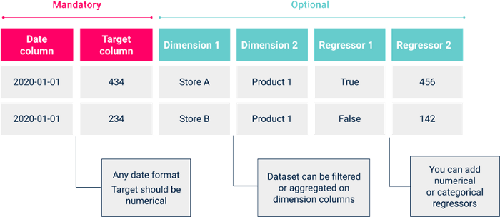
然后您就可以制作先知模型了!要开始建模,首先需要上传 dataset 的 csv 文件,格式如下。.
然后,您可以在侧边栏中提供您的规格要求,以执行符合您需求的预处理任务并调整模型超参数。一旦对结果感到满意,请保存您的实验,以保留所有可视化效果,并能在之后轻松重现。.
云部署
如果您想让多个合作者都能轻松访问应用程序,而无需让他们下载 Python 并安装软件包,您可以在 cloud 上部署应用程序。首先需要克隆 git 仓库。然后,您可以使用 Docker 命令轻松地将应用程序容器化,并创建一个映像,用于在您选择的 cloud 平台上部署应用程序。这 条 详细介绍了如何在 Google 云平台上实现这一功能。.
非常感谢您的阅读,我很乐意听到您的反馈意见。如果您希望为软件包开发做出贡献或有任何改进意见,请随时联系我。同时,您可以访问 项目库 观看简短演示和 Artefact 科技博客 了解有关 data 科学项目的更多信息。.